/24
The Problem
The old Wiertz website wasn’t pulling its weight. It felt outdated, cluttered, and difficult to navigate, leaving both job seekers and employers frustrated. Simple tasks took too many clicks, and key information was buried under layers of confusing menus. It wasn’t just a visual problem, it was structural. The platform needed a complete overhaul to make it clearer, faster.

Process
Step 1: Discovery & Research
I started by digging into the data analyzing user flows, pinpointing drop-off points, and understanding where people were getting stuck. I looked at how job seekers and employers interacted with the platform and identified the areas causing the most friction. This phase set the foundation for every decision that followed.
Step 2: Strategy & Information Architecture
Next, I tackled the structure. I reorganized the website’s content, simplifying navigation and creating clear pathways for different user groups. Wireframes helped me outline the new flow, ensuring every click felt intentional and led users exactly where they needed to go without unnecessary detours.
Step 3: Design & Prototyping
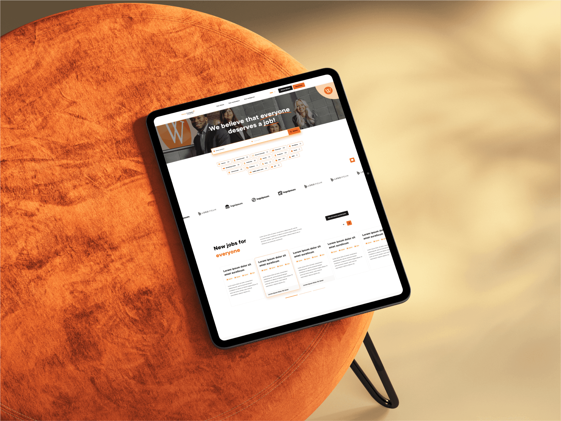
With the structure locked in, I moved into design. Every visual element was crafted to balance brand personality with usability. Typography, color choices, button placements, they all worked together to create an experience that felt polished, modern, and intuitive. High-fidelity prototypes helped finetune the details and ensure everything clicked (literally and figuratively).
Step 4: Testing & Refinement
Before wrapping up, I tested the site with real users. Observing how they interacted with the design gave me the final tweaks needed to eliminate friction and smooth out any rough edges. The final product was refined to work seamlessly across devices, ensuring consistency in every interaction.
Solution
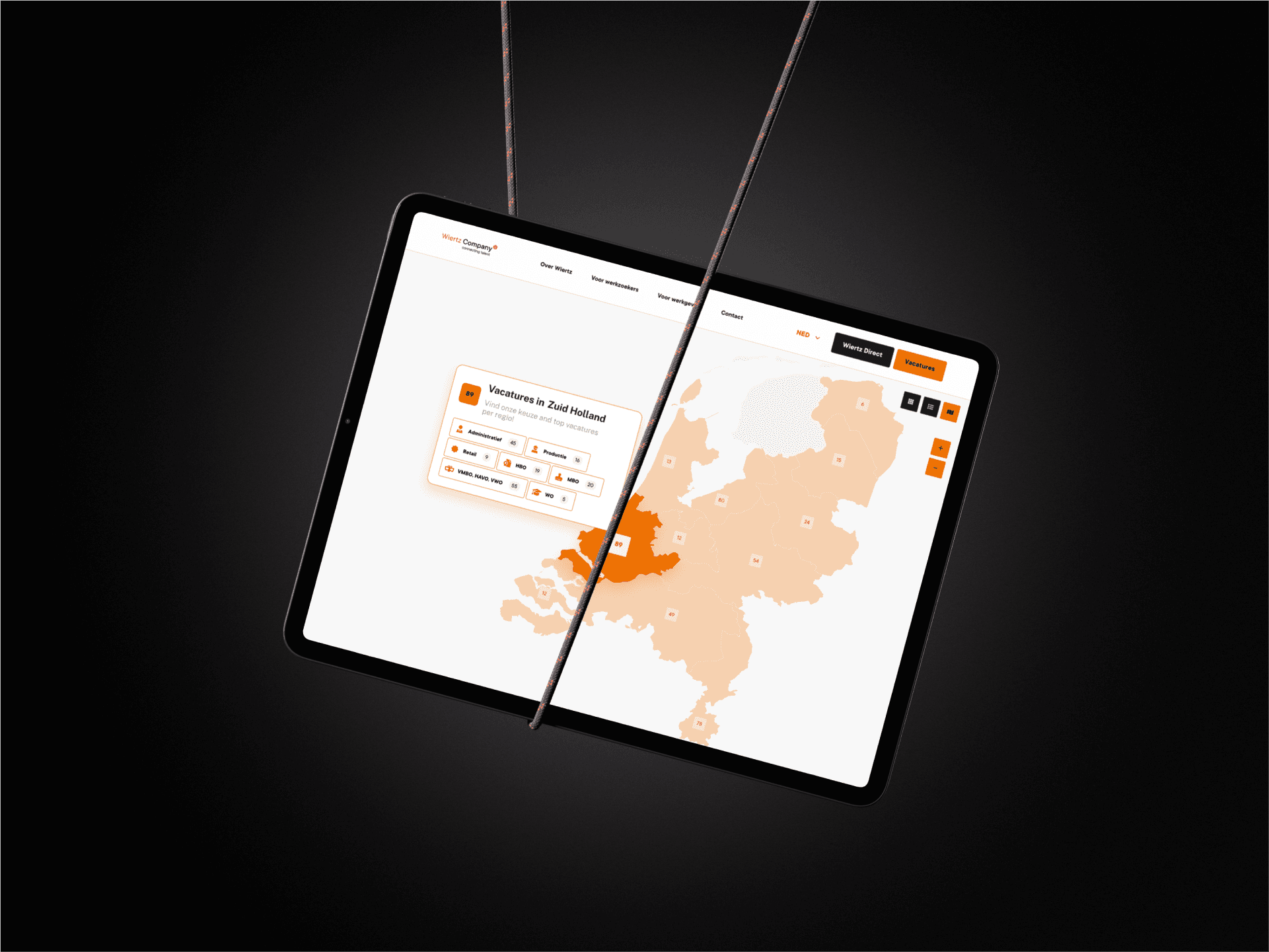
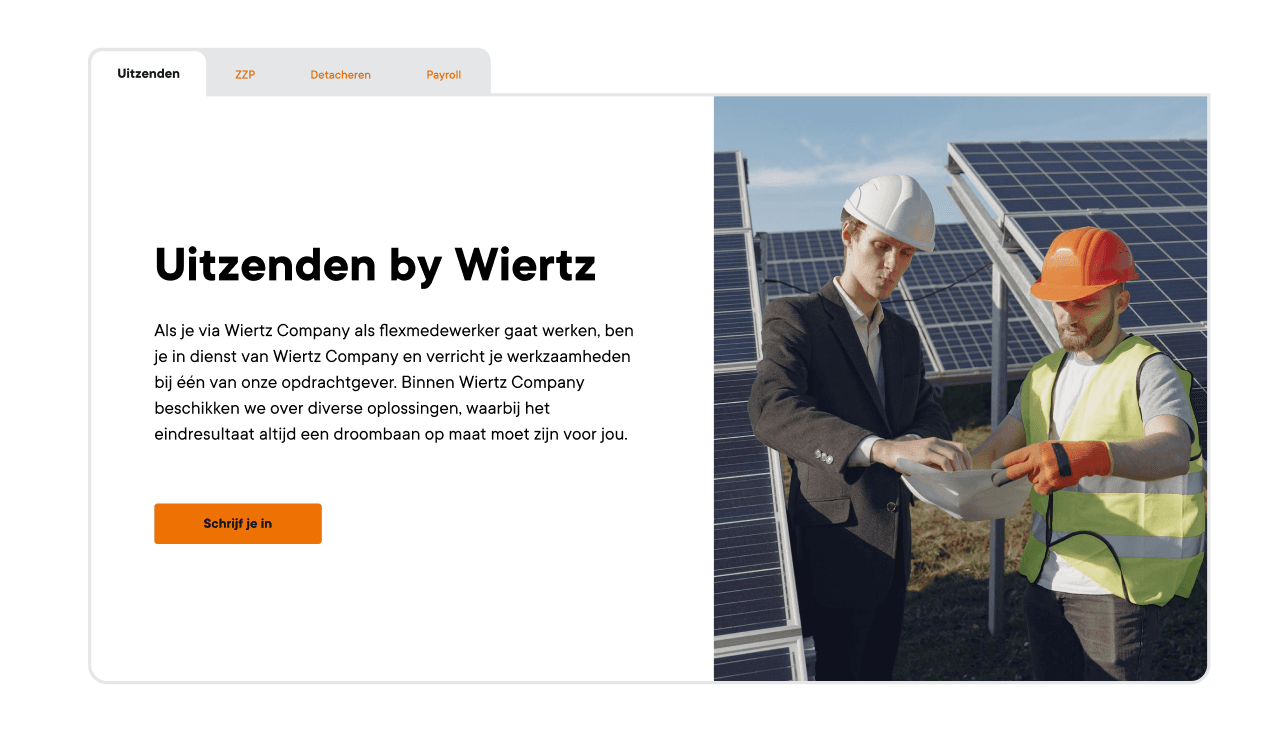
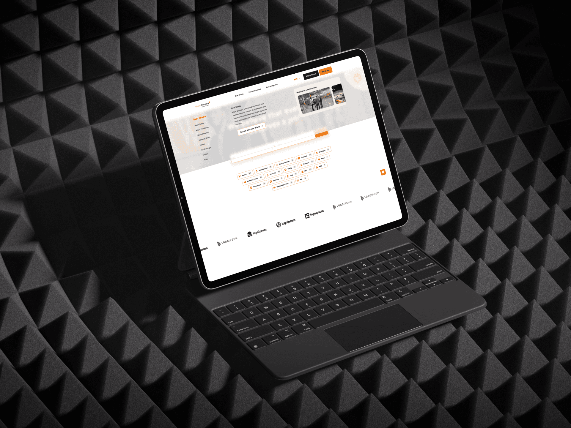
The result is a website that feels intuitive and purposeful from the first click. Also, the website needed a clear navigation, and I opted for something that would create a mind map for Wiertz's users. Something clear and concise was to break into the pattern of separating parts of the website for each type of visitor related to their target audience and persona. Job searches are efficient, and employers can access tools without digging through endless menus. The design balances clarity with visual appeal, creating an experience where every interaction feels smooth and natural.
Outcome
The improvements were clear from month one. Bounce rates dropped, engagement levels rose, and the overall feedback was overwhelmingly positive. Job seekers found opportunities faster, employers connected with talent more efficiently, and Wiertz now has a platform that reflects their mission, clear, professional, and focused on people.
